 This week we had a discussion of graphics and visual styles in video games. Some games quest for verisimilitude (realistic graphics that give the appearance of being real and true.) Verisimilitude can be great for creating an immerse gaming experience, communicating realistic emotions and reactions from characters and aiding function of game mechanics. However other games intentionally trust their visuals to a more stylised or classic cartoony look, to avoid the uncomfortable sins of the uncanny valley and to help players suspend belief in order to absorb a moment of gameplay, character or landscape that would be impossible in the real world. To explore this topic, I am going to list 4 games. Two games will be an example of Verisimilitude or Stylised graphics done well and two others will be an example of the limitations of the opposed styles.
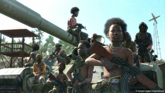 For years, the Metal Gear Solid series was desperately waiting for technology to evolve so that it could exist in the realistic representation of itself that Hideo Kojima (the series' creator imagined). With each game in the series always pushing the generation's graphical limitations, it wasn't until MGS4 and ultimately MGS5 that we finally got to see the Metal Gear world burst to life in true verisimilitude. This game uses the it's realistic visuals very powerfully. MGSV provides lush realistic sandbox environments that you must use to your advantage as if you were infiltrating them in the real world. Realistic cinematic shot in one take is like watching a movie with real people. When exploring the darker themes of the game, this helps generate deeper and more horrific emotions in the player. In fact this game pioneers some heavy facial motion capture technology, and characters such as the previously talkative Snake and the thematically silent character Quiet, were written to express more dialogue through facial animation and twitches then through actual words. The game also incorporates incredible detail to gameplay based on realism such as snipers reflecting in the light to reveal enemy and player locations, the need to shower if coated in too much blood and tranquillized enemies drowning if they land face down in the smallest of puddles. These kind of augmented gameplay elements would not be possible if it wasn't for motion capture and the visual style simulating verisimilitude.
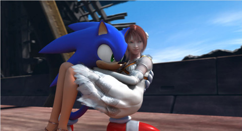
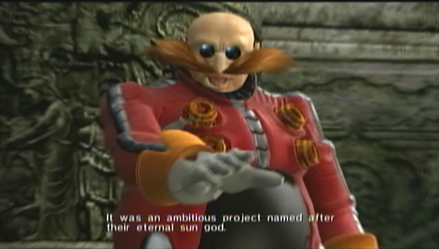 Sweet Solaris... Sonic the Hedgehog (2006) is the textbook example of bad game design and how to screw up a successful franchise. But we are only going to focus on one of its many cardinal sins of game design today, that being it's choice to develop the game's aesthetics with realistic verisimilitude. This game was rushed to meet the launch of the Xbox 360 and the exciting new world of HD next-gen graphics. I owned a copy on PS3 and it is still to this day, one of the few PS3 games I actually own that runs in full 1080p. So it is no surprise that Sega fell for the trap to push Sonic the hedgehog into that world. But as they attempted they learned some really inconvenient truths about the world they created. Mainly that you can only make a blue anthropomorphised cartoon hedgehog look so realistic. Whilst some of the environments in Sonic '06 look quite lovely with their real world Europe inspired flair, this game is rife with uncomfortable and uncanny moments. Sonic and all his friends look like freaks of nature standing aside detailed final fantasyesque humans. This is made worse by Dr. Eggman's ugly uncanny redesign and the moment when Princess Elise kisses Sonic the Hedgehog. A lot of things did not gel well in this game, but the visual aesthetic of giant mutant hedgehog making out with a realistic human girl is enough to make any gamer, get out of their chair, take their guns and defend their porch and daughters.
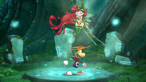 Rayman as a series has always been cartoony and whacky and that's one of the reasons the franchise was so successful in the early 2000s. But after Rayman got knocked off of Ubisoft's priorities due to their crippling obsession with raving Rabbids, and the 3D-platformer having sailed, Ubisoft had to think of an inventive way to bring him back. So they decided to throw back to their original cartoon origins with the aptly named Rayman: Origins. This game is built in a powerful new engine Ubisoft invented called the Ubitoon Engine. Which allows for characters to be animated automatically by stretching silhouettes. This meant the whole game was made from stunning handdrawn cartoon animation was was both hilarious and added to the zany quirky and fast flow animation of the hectic 4 player platformer. The world is whacky and zany and perilous with crazy themed lands so the cartoony-style and slap-stick sensibilities with the added in-game ability to literally slap your friends meant that Ubisoft hit stylisation gold with this rebooted approach to Rayman. I seriously hope Ubisoft continue to make games in this engine because all the games they've made with it so far have been gorgeous.
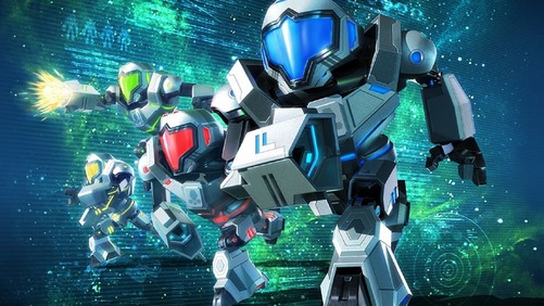 This may be a little unfair as the game isn't out yet and we've only seen a small dose of E3 trailers and gameplay footage. But when your announcement trailer has a 90% dislike ratio and a petition for cancellation that reached 7,500 signatures in 24 hours and 20,000 within 2 months, that means people take issue with your game. There are a couple of other reasons that coincided with the dislike, Samus not being the main character, the lack of focus on exploration and the confirmation that a Wii U Metroid game was not in the works left a lot of Metroid fans feeling bitter. But I sincerely think the art style is what disappointed people the most. Next Level Games is handling the Metroid Franchise for the first time and they are capable of some pretty fun aesthetics from their brutal take on the mario universe in Mario Striker's Charged to the delightfully spooky aesthetics of Luigi's Mansion 2. They are a capable studio. But even from this promotional art here, it looks bland uninteresting way too angular and lacking any of the exotic and mysterious sci-fi stylings that usually accompanies the metroid universe. Because the game is on 3DS the visuals have been made very simple and polygonal, with the human characters inside the suits stylised as very "chibi" or super deformed almost Mii-like. The Metroid universe has never been portrayed like this. Even in other GBA hand-held Metroid games, the player was treated to beautiful detailed pixel art. So I believe this over stylisation to make the Metroid universe has actually blown up in Nintendo's face in a rare scenario. They have not picked the visual style that best suits the characters and lore of the Metroidverse. The gameplay may yet to be fun, but Nintendo will have a long uphill battle with this title to get fans to play it, purely on aesthetic alone.
References: http://www.forbes.com/sites/ewanspence/2015/10/17/microsoft-office-2016-review/ http://www.leagueofgamemakers.com/reality-check-verisimilitude-in-game-design/
0 Comments
Leave a Reply. |
AuthorBen Spanos is currently playing Undertale, Uncharted: Among Thieves and Legend of Zelda: Triforce Heroes. Archives
March 2018
Categories |


 RSS Feed
